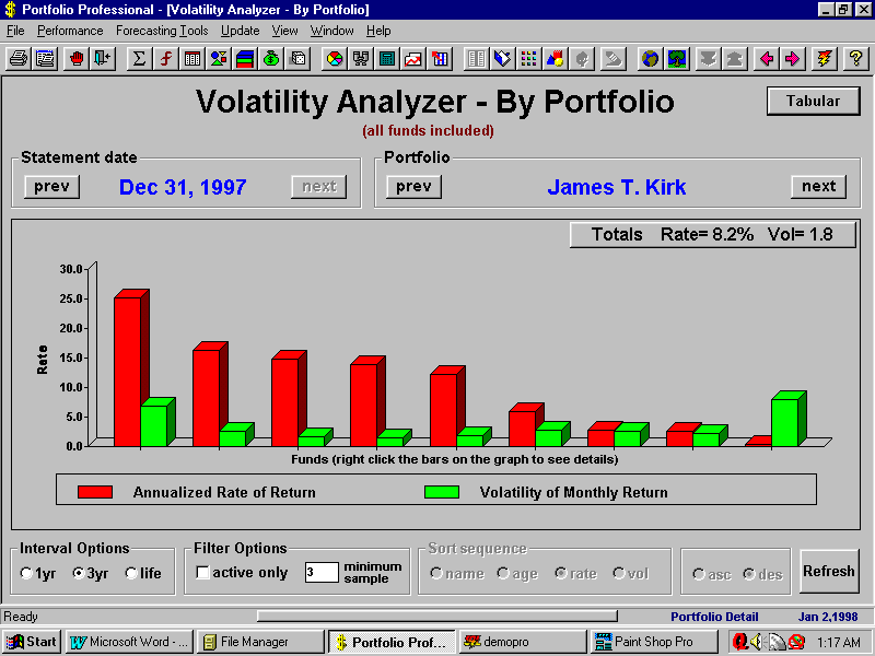
| Screen Shot - Volatility compared with performance |
| This screen compares the performance of your investments with the volatility in their monthly rate of return. Each pair of vertical bars represents a security. In this example, the investments are ranked in order of their performance. The red bars represent the 3 year rate of return and the green bars represent the standard deviation in the simple monthly return over the 3 year period for each investment.
The Tabular option for this function allows you to see the same data in a table, with each line of the table representing a security. Each line includes the volatility and rate of return for the period enabling you to easily compare your investments in terms of their performance and volatility. |