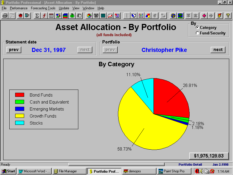
| Screen Shot - Asset allocation pie chart |
| The Asset Allocation Pie Chart illustrates the distribution of investments in a portfolio on a percentage basis. Total value can be broken down either by category or by security.
To see how your asset allocation has changed over time, you can use the statement date scrolling keys (previous and next) and observe the changes in the pie chart. When you select the By Category option, double-clicking anywhere in the pie chart will replace the pie with a new pie containing only the funds and securities in the selected category. You can right-click on any pie piece to see the dollar amount being represented. |