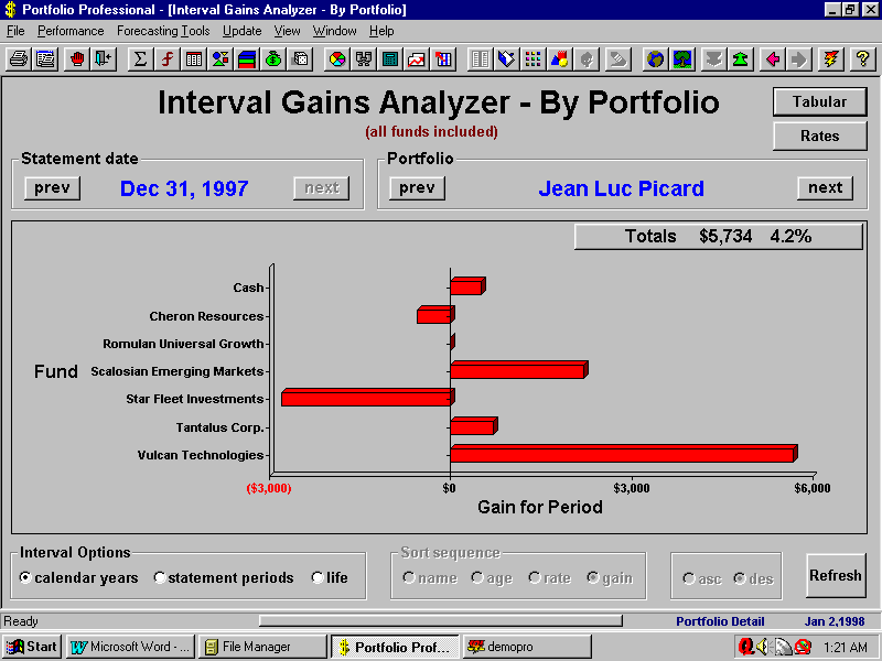

| Screen Shot - Gains graph for a calendar year |
| This screen summarizes gains for an individual portfolio for any calendar year. Each investment held during the year is represented with a bar in the graph. You can quickly see where money was gained or lost. The rates option allows you to switch to a comparison of rates rather than dollar gains.
The Tabular option for this function allows you to see the same data in a table, with each line of the table representing a security. Each line includes the dollar gain and rate of return for the year enabling you to easily compare your investments in terms of their performance for the year. |


